Product Material Inspection Application
Research-driven redesign that cut inspection time by 58% for a global electronics manufacturer.
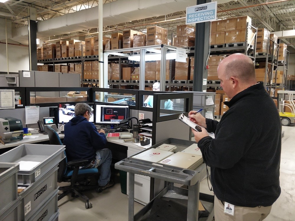
Phoenix Contact's Middletown, Pennsylvania facility manufactures thousands of industrial components: terminal blocks, connectors, surge protection devices. These components requires quality inspection before shipping, but their outdated inspection application had become a bottleneck.
Slow page loads, multi-screen workflows, and enough friction that inspectors had developed their own paper-based workarounds.
My Role: I led the UX research and product design for the redesign. Working with Quality team stakeholders, engineering, and cross-functional teams, I lead the project from initial research through launch and post-deployment support.
Challenge
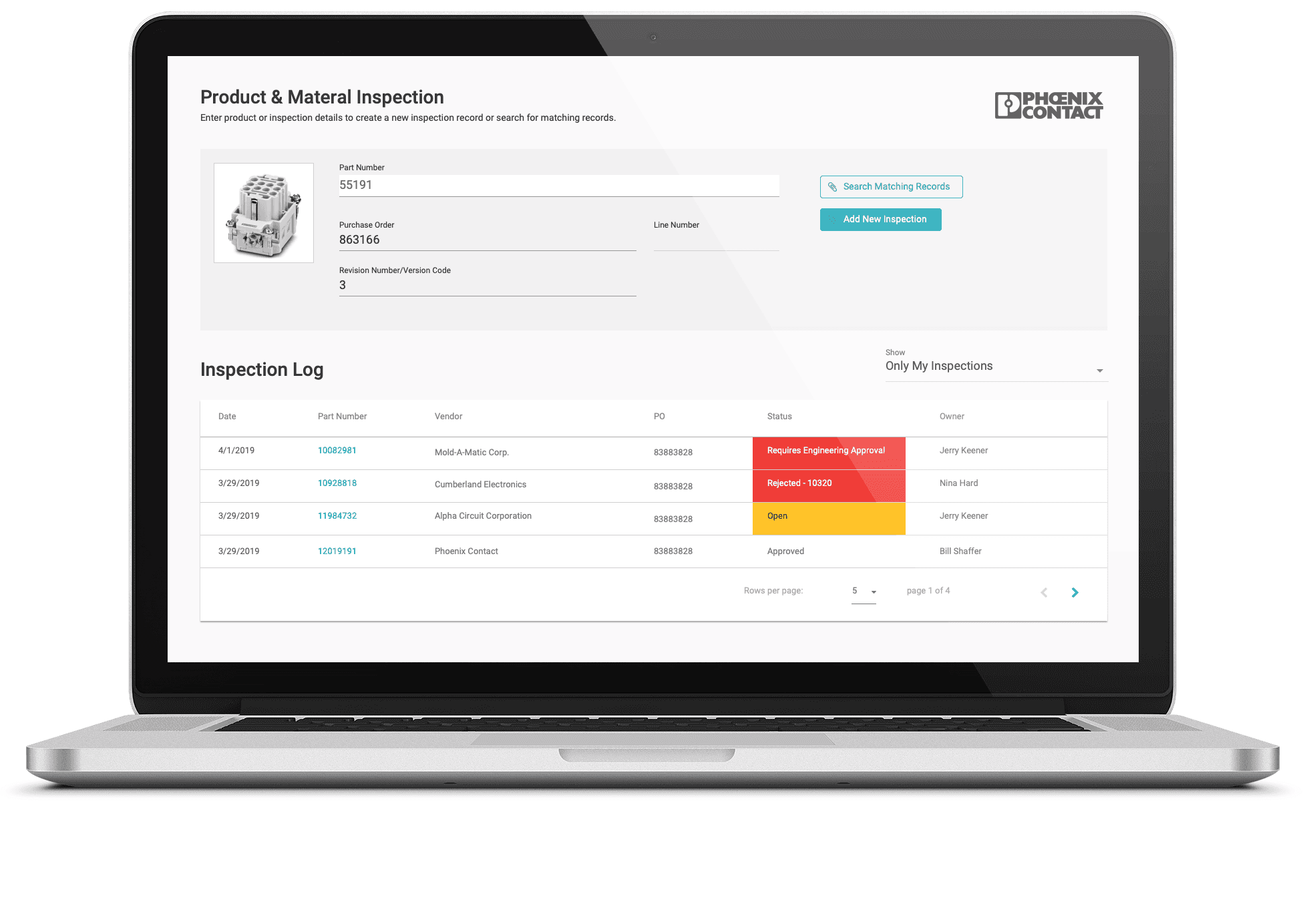
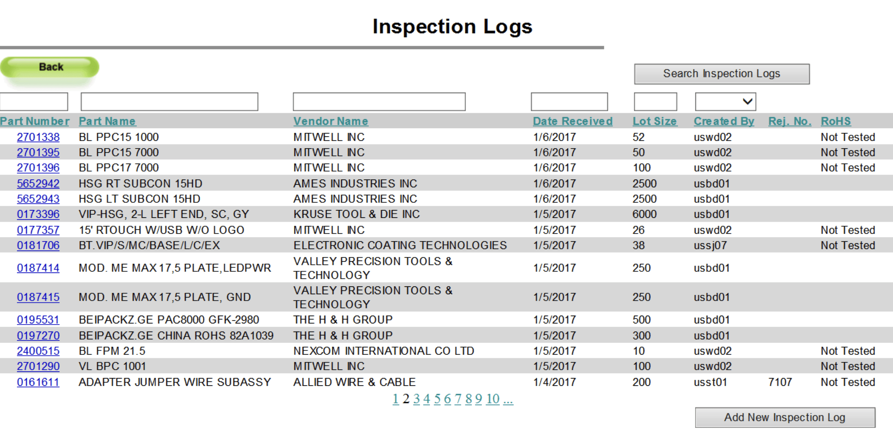
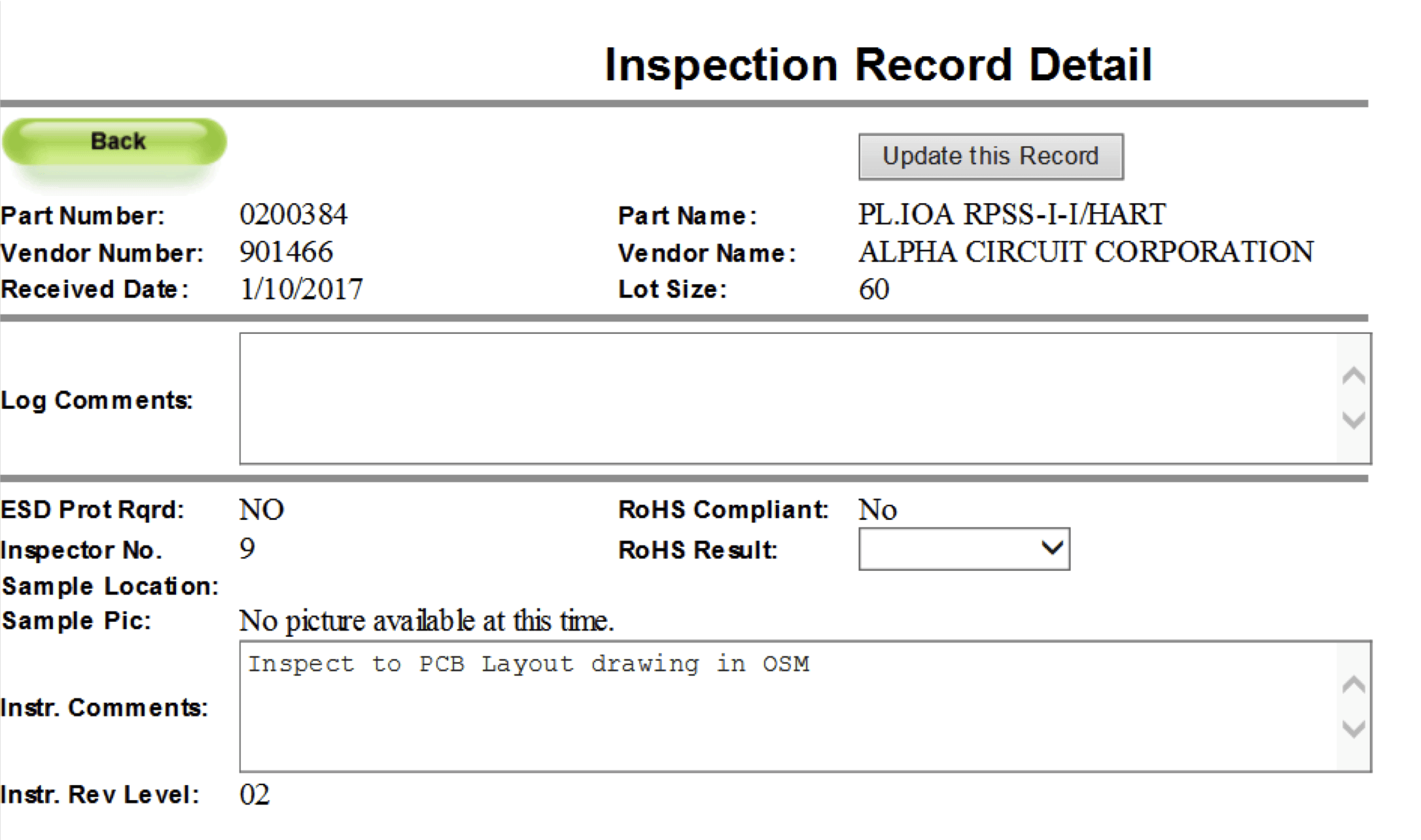
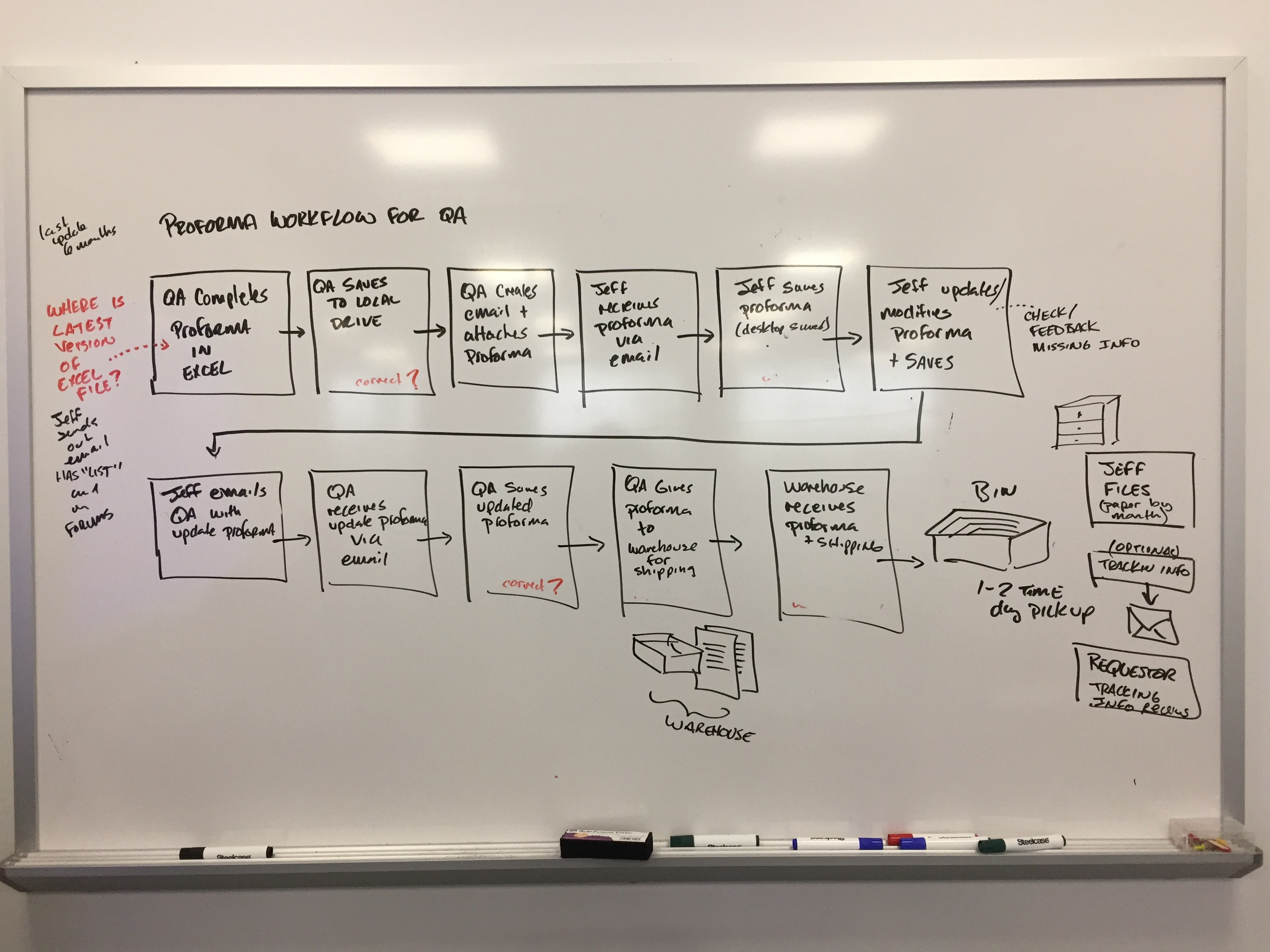
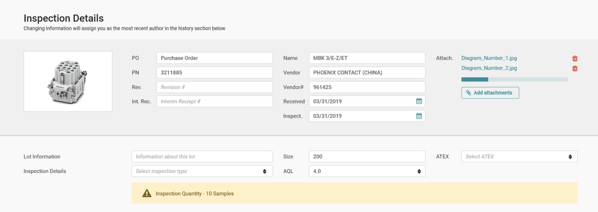
Phoenix Contact's Middletown facility manufactures thousands of industrial components that require quality inspection before shipping. The existing inspection application had become a bottleneck. Page loads took several seconds, completing a single inspection required 51 clicks across multiple screens, and inspectors had started keeping handwritten notes alongside the digital system (prior UI and workflow shown below).

I worked as the lead UX researcher and product designer in partnership with Product Management, Quality Team stakeholders, Engineering, and cross-functional teams. That meant conducting research with inspectors and stakeholders, designing the interface and workflows, and testing solutions through development and launch.
The constraints were real: limited development resources (12 to 20 hours per week initially, then one full-time developer), integration with existing ERP systems, multiple user roles with different needs, and 60,000+ SKUs to handle without disrupting production.
The redesign improved how inspectors work:
58% faster inspections (5:23 → 2:13 average time)
57% fewer clicks (51 → 22 per inspection)
67% fewer screens (3 → 1 for standard workflow)
Eliminated paper workarounds and audit trail gaps
The result: a system that increased inspection throughput without adding headcount and restored the digital audit trail for compliance.

Research
I knew interviews would only tell part of the story. Manufacturing workflows are physical and messy, with multiple handoffs that people don't always remember to mention. So we tried something different.
The Follow-the-Bin Method
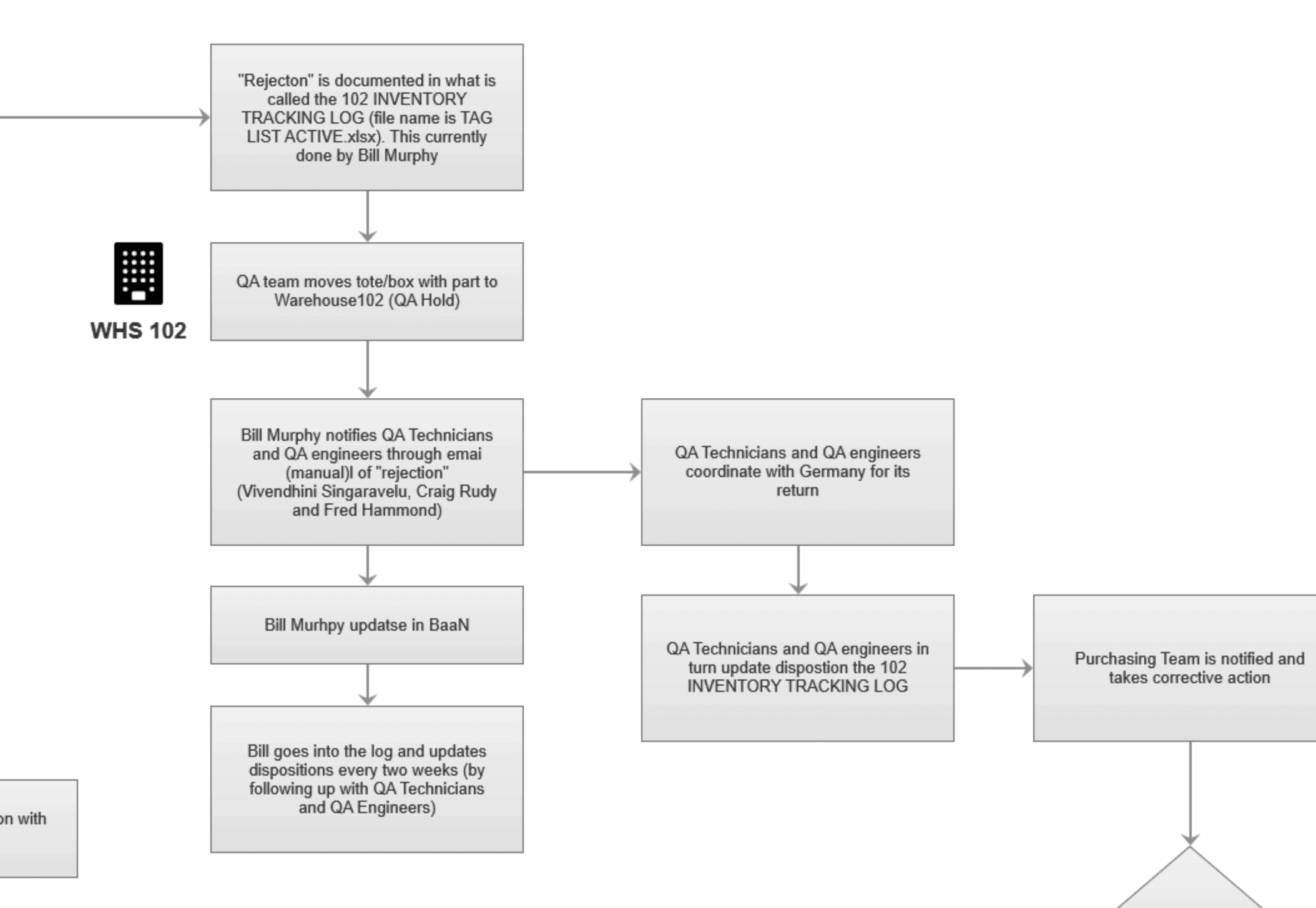
We placed large, bold signs on selected inspection bins: "If you touch this bin, please contact Andy." The goal was to track bins (they held the electronic items to be inspected) end to end through their complete journey over a week. Each time someone contacted me, I documented the touchpoint with a custom tracking worksheet: who touched it, when, where, what they did with the system, and what happened next.
What we learned changed how we thought about the problem. Bins moved through multiple people across different departments. Each touchpoint had different needs from the system. Handoff moments were invisible in the current app. There was no way to see upstream or downstream context. Inspectors worked in isolation without visibility into where bins came from or where they were going. Engineers needed override capability but the app treated them like inspectors. Purchasing and logistics needed visibility but had no access to the system at all.
Core Insights
The existing application wasn't just slow. It was designed for individual tasks, not a connected workflow. Each person optimized their piece without seeing the whole system.
The multi-screen, multi-click process wasn't just a UI problem. It reflected a fundamental misunderstanding of how work actually flowed through the facility.
Baseline Metrics and Contextual Observation
We also conducted one on one contextual inquiry sessions with inspectors using custom activity logs to capture baseline performance. We tracked time on screen per inspection type, number of clicks (within the app and outside applications), task start and end times, and success rates. The baseline: 5 minutes 23 seconds, 51 clicks, and multiple screens and lookup applications per inspection.
Performance analysis of the existing system showed the Receiving Inspection Log screen took over 8 seconds to load. This was a major bottleneck we needed to account for in the redesign. Stakeholder interviews with QA engineers, purchasing, and logistics teams revealed edge cases and cross-functional needs we wouldn't have discovered otherwise.

Insights to Design
The research revealed three core problems: enable workflow handoffs between roles, collapse the multi-screen inspection process, and build trust in the digital system. Here's how those insights shaped the design.
Design for the Workflow, Not the Task
One application serving four distinct user roles. Inspectors needed speed. Engineers needed override capability. Purchasing and logistics needed visibility. The existing app treated everyone the same, which served no one well.
We designed role-based permissions and conditional views. The interface adapts based on who's logged in. Each role gets what they need without navigating around features meant for someone else.
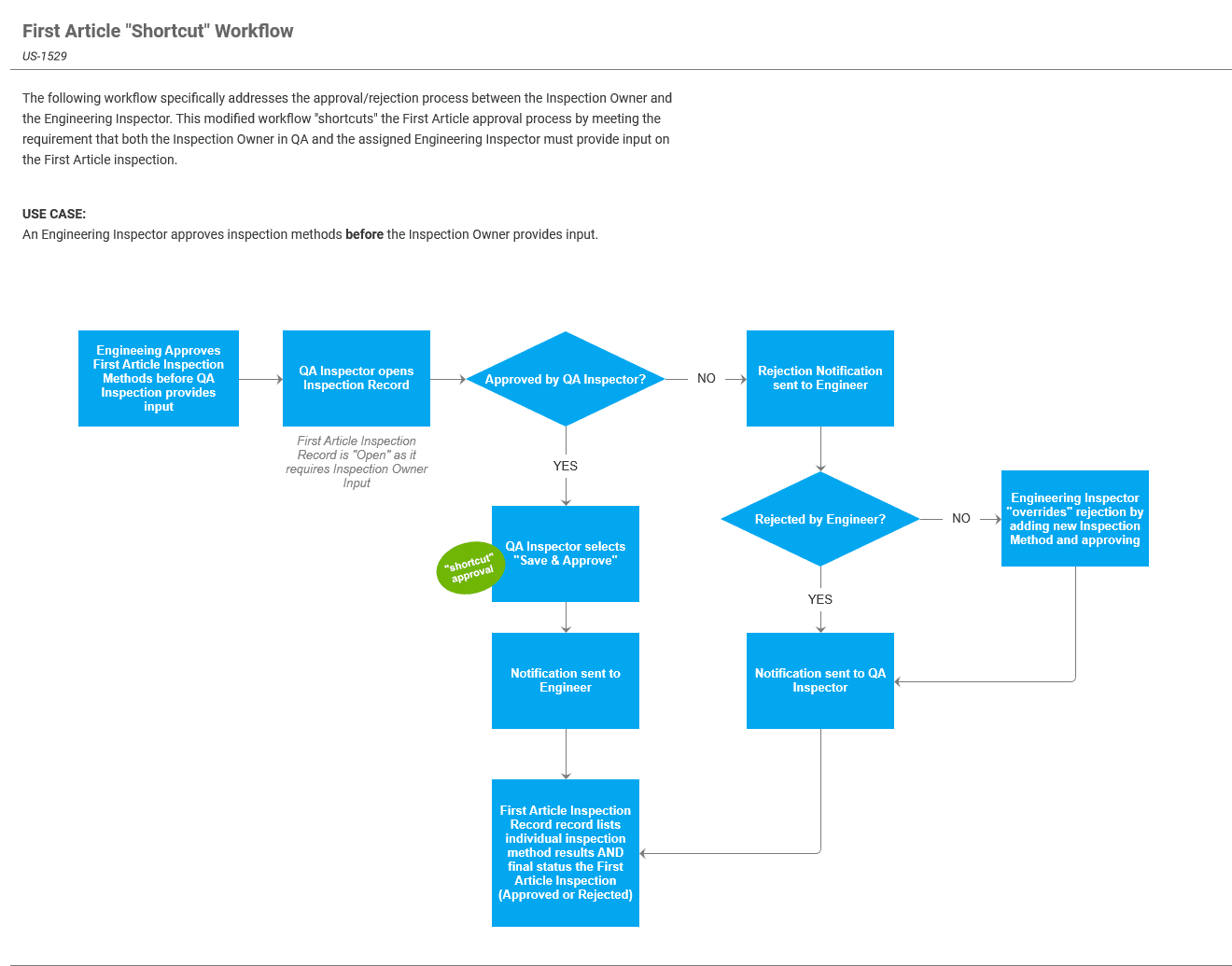
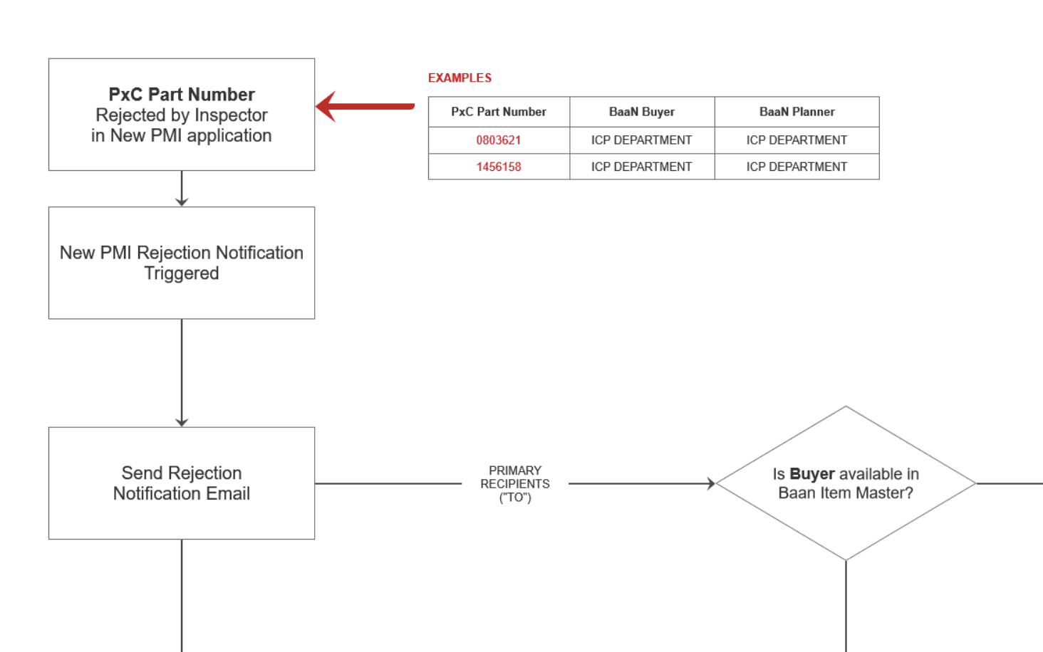
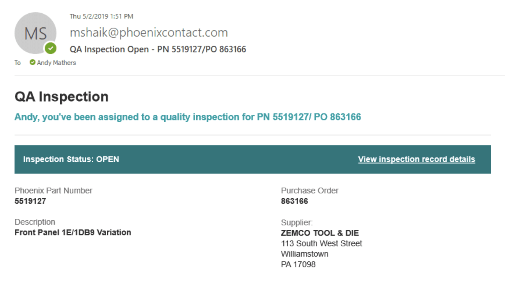
Engineer Override Flow: When an engineer approves or rejects an inspection, the system creates a structured notification with full context. The engineer can approve, reject with reasoning, or request more information. Every decision gets logged with timestamp and audit trail.
The Follow-the-Bin research showed handoffs were where information got lost. By designing explicit handoff moments with proper context, we reduced the "what happened to this bin?" questions.
Collapse Complexity, Preserve Precision
Baseline research showed 5 minutes 23 seconds and 51 clicks across 3 screens per inspection. Manufacturing inspection requires precision, so we couldn't just simplify aggressively.
We consolidated three screens into one unified inspection interface. Smart defaults handle common cases. Advanced controls are tucked away. The interface adapts based on inspection type.
The result: 2 minutes 13 seconds, 22 clicks, 1 screen.
The multi-screen workflow wasn't just slow. It broke concentration. Every screen transition was a chance to lose context. Collapsing to a single interface maintained flow state while preserving the precision manufacturing inspection requires.


Build Trust Through Smart Design Decision
Inspectors and engineers didn't trust that a digital system would protect them in a regulatory audit. Paper forms felt safer. This wasn't irrational. Audit trail integrity is genuinely critical in manufacturing.
We designed a complete audit trail with timestamps and history tracking. Digital signature capability replaced paper sign-off for First Article inspections. Version tracking shows change history. The real work was getting stakeholder approval that this digital approach met compliance requirements.
First Article Digital Sign-off: The old process involved printing forms, walking to the engineer's desk for signatures, and filing in cabinets. The new process: digital inspection, system notification, engineer approval with reasoning, complete logged history that's searchable.
Navigating Complexity and Constraints
Manufacturing environments come with constraints and surprises that shape everything. Here's how we navigated them.
Started with observation, not just interviews
Interviews surfaced pain points like slow page loads and too many screens. But we needed to understand the system, not just the complaints. Follow-the-Bin revealed how bins moved through five people across departments, each with different needs. The method exposed workflow complexity and handoff problems that interviews completely missed. Physical workflows need physical observation.
Constraint breeds better design
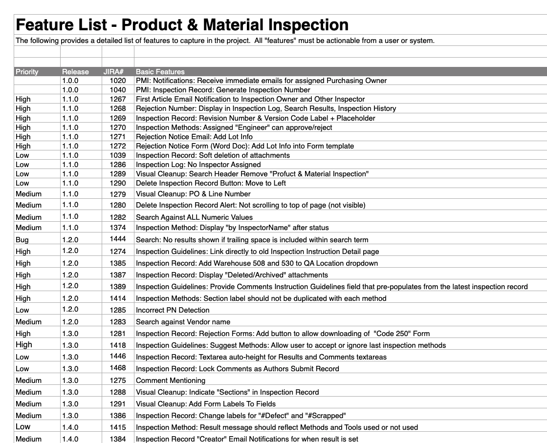
We had one developer for 58 features in five months. Every feature had to justify its complexity. Design specs answered implementation questions before they were asked. We built components once and reused them everywhere. The constraint forced ruthless prioritization. No bloat, no nice-to-haves. We shipped all 58 features on schedule.
Navigate domain complexity early
A fundamental misunderstanding about which AQL standard PMI actually used. Everyone thought they were aligned. Everyone used the same terminology. But they meant different things. We scheduled terminology sessions with domain experts to build shared understanding from first principles. A two-hour crash course in Week 1 beats a crisis meeting in Week 50.
Outcomes & Impact
The new Product Material Inspection application released on schedule and within the resource constraints we navigated. Side-by-side usability testing with inspectors showed the redesign delivered measurable improvements to their daily work.
58%
Reduction in Time Spent Per Inspection
Inspectors completed receiving inspections in 2 minutes 13 seconds compared to 5 minutes 23 seconds in the legacy system. This came from consolidating three separate input screens into one streamlined interface and eliminating unnecessary navigation.
57%
Fewer Clicks to Interact With
The redesign reduced interactions from 51 clicks down to 22 clicks per inspection. By placing all critical fields on a single screen and removing redundant confirmation steps, inspectors could focus on the inspection itself rather than navigating the application.
67%
Fewer Screens to Navigate
What previously required three different input screens now happens on one. Inspectors no longer lose context switching between screens, and all the information they need to reference is visible at once while documenting their work.