DESIGNS SYSTEMS
Designing at the system level: patterns, components, and craft built to scale.
A design system isn't a deliverable. It's a set of decisions that have to stay consistent as the product grows, the team changes, and the complexity compounds. Keeping that consistent takes discipline, clear communication, and a team that makes decisions together rather than around each other.
The ClearGov Design System
When we started designing and building ClearGov's second and third products, the cracks started to show.
Onboarding worked one way in one product, completely differently in another. Visual patterns were inconsistent. Interaction models didn't carry over. And what looked like a design problem was quietly becoming an engineering problem too. That's when it became clear we needed a system, not just more screens.
The moment it got real
When our front-end engineering team started building the component library, they exposed inconsistencies right down to typography, color, and spacing. That forced a pause and a rethink of how design and engineering were working together. Decisions about changing patterns in products already in production weren't made in isolation. Product managers, engineering, and design worked through those calls together.
What made it work
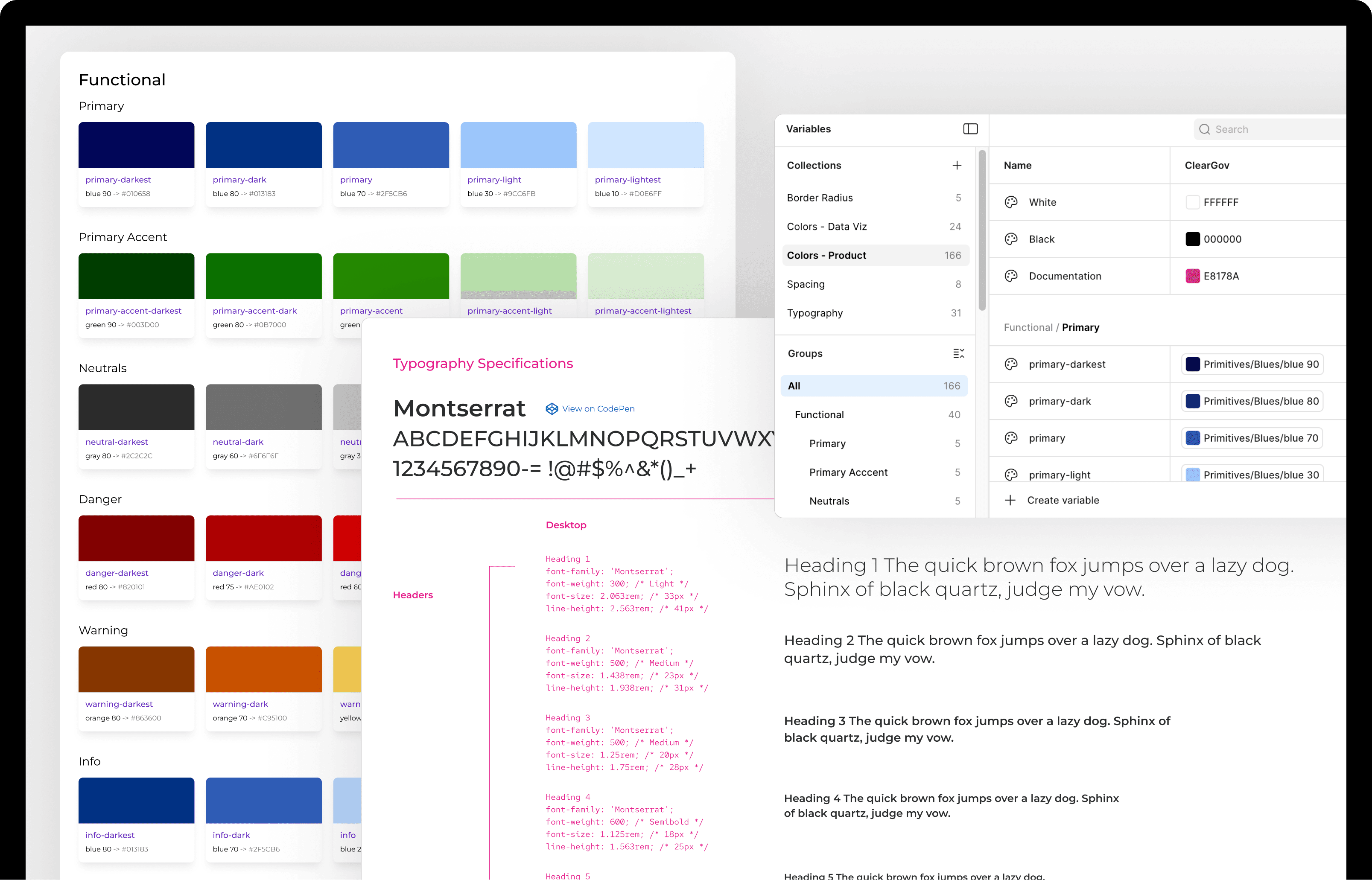
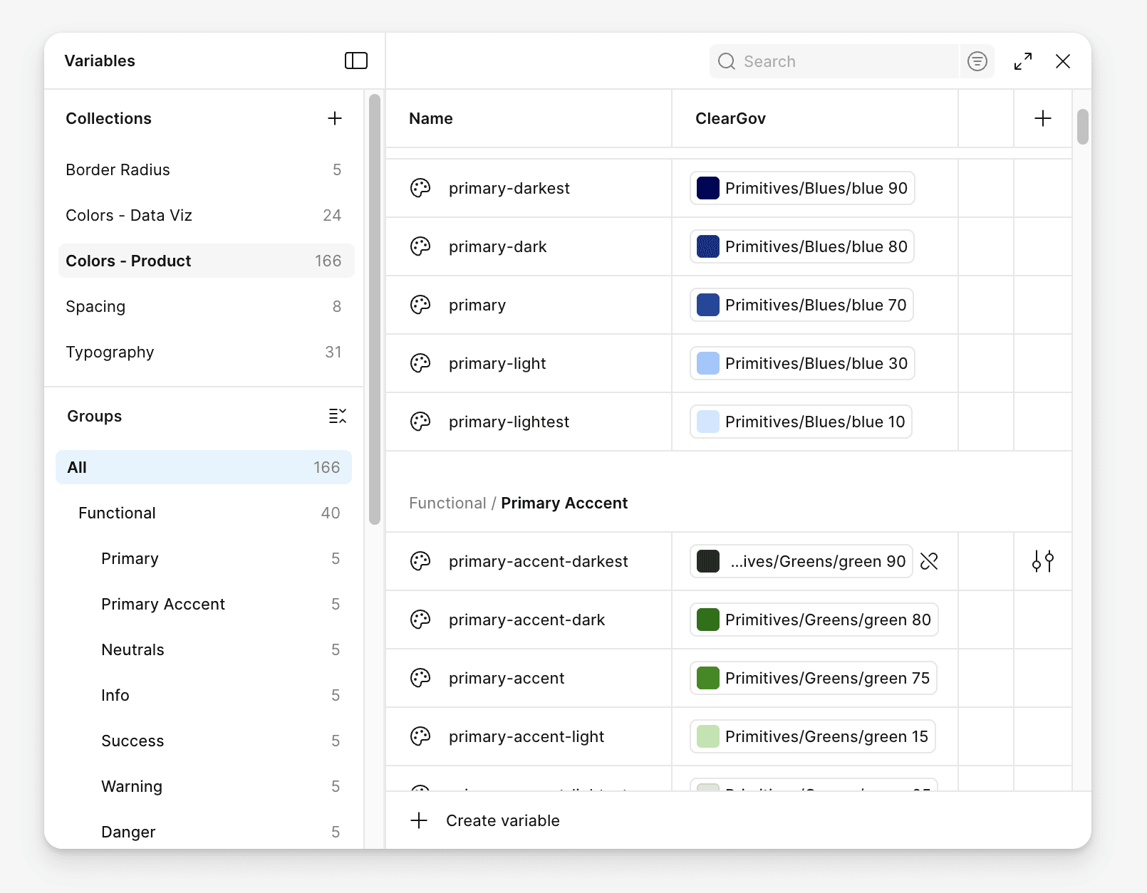
The shared Angular component library, referenced directly from the Figma design system, is what made it real. The system grew to over 50 components, with tokens and variables established to keep decisions consistent across the portfolio. But it wasn't the tactics that made it work. It was the relationship between design and engineering that got us there.
Where it's headed
We're currently experimenting with MCP servers as a way to bridge the design system and development workflow more directly. It's early, but it's the kind of evolution worth paying attention to.

A note on AI and Design Systems.
There's a version of this conversation that treats AI as a threat to design systems work. I don't see it that way. Figma's token and variable architecture is increasingly machine-readable. MCP servers are starting to make real-time connections between design systems and development workflows possible. That's genuinely useful, and worth paying close attention to.
But here's what I keep coming back to: a design system is a living record of decisions, not just assets. Every component, every pattern, every exception carries a reason behind it. Some of those reasons are obvious. Many aren't. The judgment about when to follow the system and when the system needs to evolve, that's not something you hand off. It requires someone who understands the users, the product, and the history well enough to know the difference between a gap and a deliberate choice.
Pattern Library
Design systems are only as good as the patterns inside them. These are a few examples worth calling out. Specific challenges that required more than a one-off solution, and the thinking behind how we solved them.
Control + Consequence Preview
Challenge
Local government finance professionals produce large, complex documents where a single configuration choice can meaningfully change the output. Early on, those choices were presented as named labels and radio buttons. Users couldn't picture what "Major Subsection" meant for a 200-page budget document, or what turning off a column of actuals would do to a financial data table. Testing confirmed it wasn't working, and clients were calling support to request manual changes to their accounts.
Solution
We replaced abstract controls with a consistent pattern: every significant configuration choice shows you the result before you commit. A slider tied to a live table of contents preview, with a page estimator showing exactly how many pages each level of detail would add. A grouped toggle system tied to a color-coded data table preview, using an established visual language across the portfolio: purple for actuals, yellow for budgeted, gray for totals. Two different interfaces, the same underlying principle.
Scale
The pattern appeared across five document types in three products, reaching an estimated 15,000 government professionals. It also eliminated a support bottleneck: clients who had been calling in for manual account changes could now configure their own outputs independently. Show the consequence before the commitment. That idea held every time.
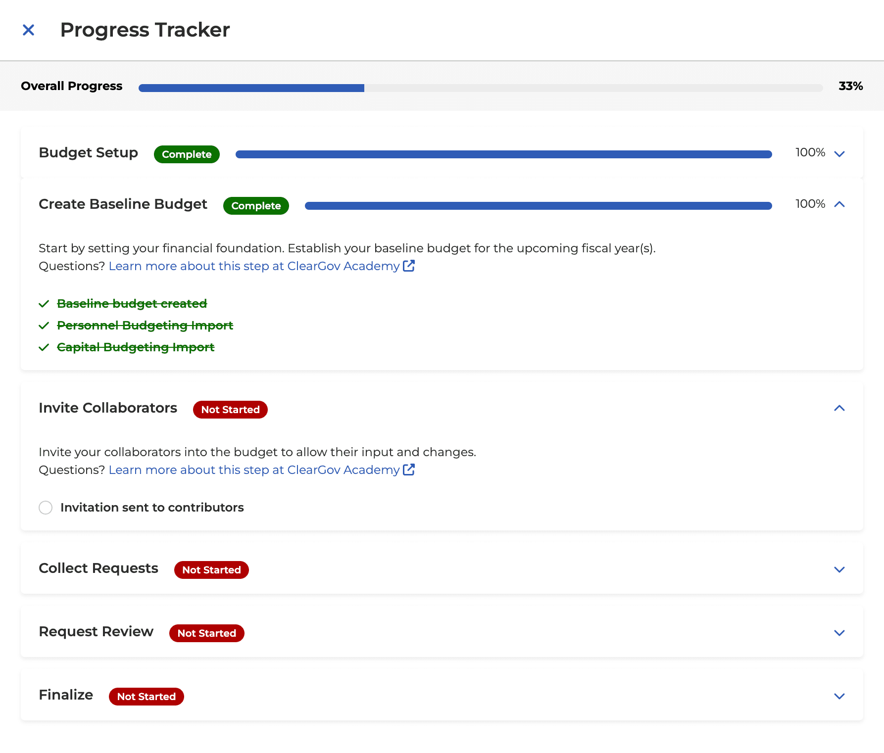
Progress Tracker
Challenge
ClearGov's budgeting workflows are multi-step, multi-week processes involving setup, collaboration, data collection, review, and finalization. Before the progress tracker existed, users had no clear picture of where they were in the process. They missed steps, hit unexplained errors, and called support to find out why something wouldn't work. The onboarding experience had no map.
Solution
We built a progress tracker that rolled up the entire workflow into a single overall percentage, then broke it down into phases with individual status indicators. Some steps the system checked off automatically when it could verify completion. Others required users to confirm themselves, because there are parts of a budget process that a finance director needs to own, not hand off to the system. Optional steps required a deliberate choice to skip rather than a passive one, keeping users aware of what they were passing over.
Scale
The pattern shipped across three budgeting products and was adopted as the standard for four more in the pipeline, seven products in total. Engagement rates increased after launch. Users who understood where they were in the process kept moving forward.